
- Client
- Canefrost, Chennai
- Sector
- F&B, juice bar
- Scope
- Identity · Packaging · Photography · Print · Digital
- Year
- 2026
01The brief
Canefrost presses sugarcane with real fruit, and adds nothing else. No sugar, no ice, no milk, no water. The brand had to make that promise feel bold and premium, not like a roadside stall.
We built Canefrost Bold: one deep green, one bright yellow, heavy type and product photography where the bottle carries no printed label. Then we carried it through three product lines, the menu, the counter, print and the screens customers order on.
02Wordmark

03Colour
Green does the talking. Yellow is used once per surface. Each product line gets its own tag colour.
04Typography
Aa
Outfit
Labels, prices and headlines. Black weight in capitals, short and loud.
Cane Blends · 240 ml · 500 ml
Aa
DM Serif Display
Product names and big statements. The warm, hand-pressed voice next to Outfit.
Mango, Lemon & Ginger, Jamun
05Three lines, one system
81 flavours sorted into seven flavour families, named the same way on the menu board, in the app and on delivery platforms.
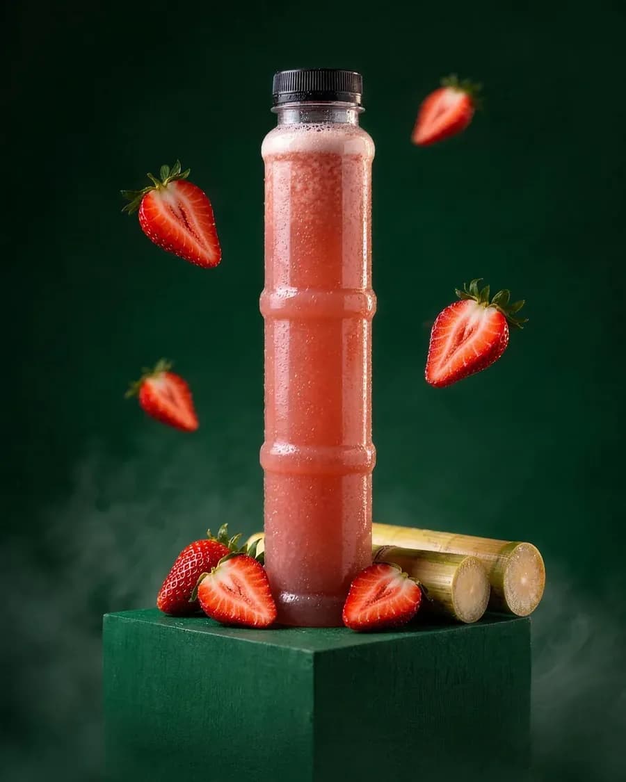
Fresh-pressed cane with real fruit.
36 flavours
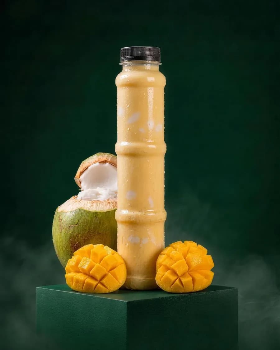
Cane and tender coconut, creamy with malai.
20 flavours
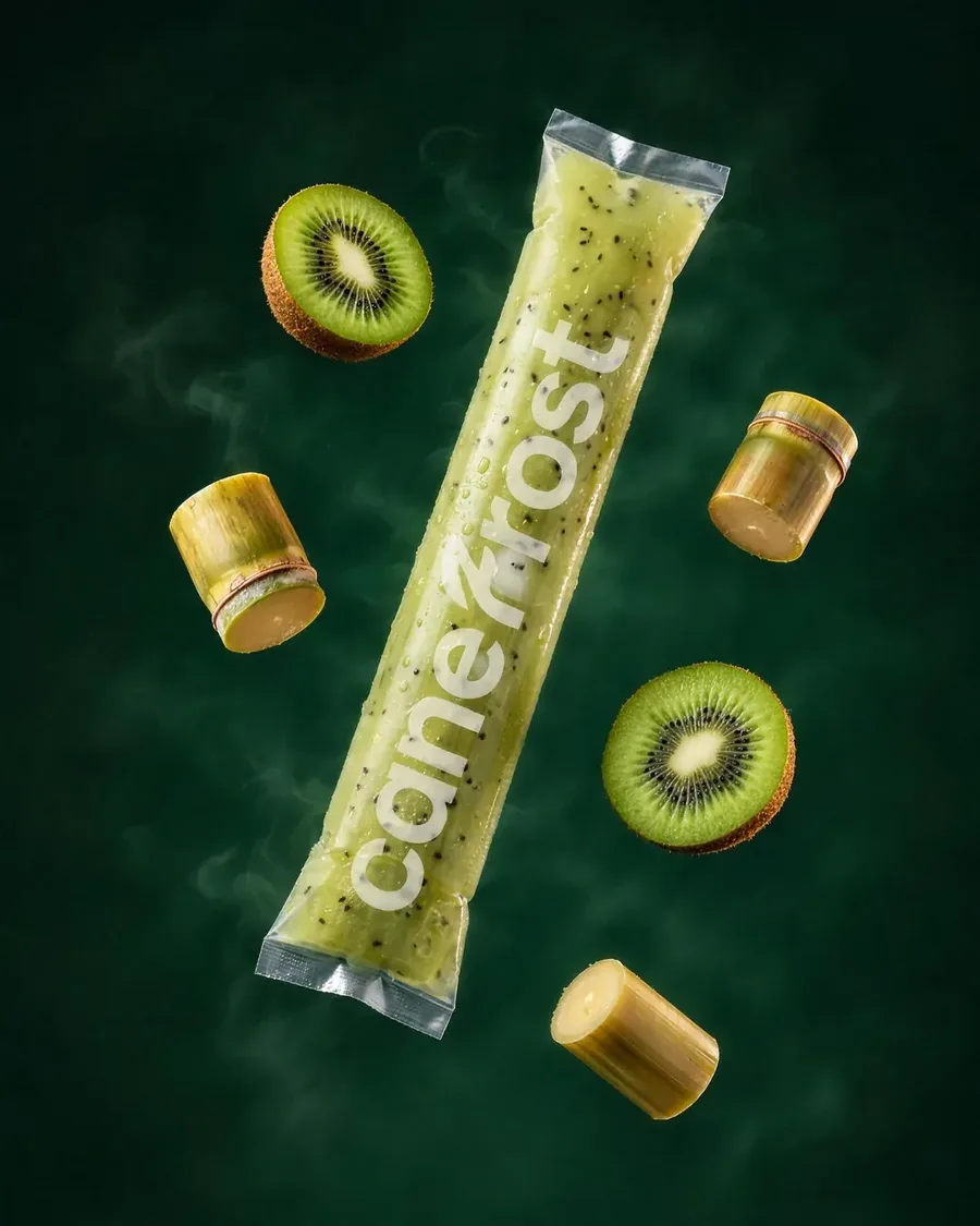
Fruit and cane, frozen in a slim pouch.
25 flavours
06Art direction
The bottle says nothing. The fruit says everything.
- The client's own bottle, front-on, with no printed label, only a small round seal.
- A deep green block and backdrop, low mist, cut cane at the base.
- No ice anywhere: the brand adds none, so the pictures don't either.
- 85 product photographs and a film for each line, shot to one recipe.


07Flavour icons
A flat illustration for every flavour, in two variants (170 in all), used for menus, filters and signage.


08In store
Scan. Order. Sip.
An A3 counter poster and a tri-fold menu brochure that send customers from the queue to ordering on their phone.


09On screen
The same voice in the app, the website and the counter.


Next
Quickka →